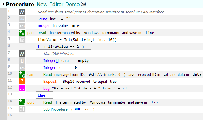
With the release of version 6.7, SeqZap has made the transition to the flat user interface look of modern applications.

The new look is designed to make scripts more readable by standardizing colors, fonts and icons.
- It is easy to spot the tool steps which interact with workbench tools (port and can above).
- The icons are simple and easy to decode, e.g. all expects use the same color.
- Steps with similar behavior has similar icons, e.g. all the tool steps in the example above use the same icon because they all read/get one or more values. This also makes it easier for tool developers since most icons can be created without designing new icons.
- Procedure Call steps use the same font color as the procedure itself.
The new design also makes it possible to edit much of the script directly in the editor, for example, it is now possible to edit the procedure name directly.
We would like to thank all our users who participated in the beta testing of the new UI, thank you for the feedback!
The new release is available now, and can be downloaded from SeqZap’s “Upgrade/Downgrade” dialog.
